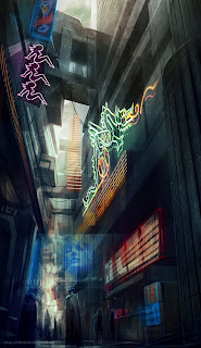
Well here it is. Not quite what I initially visualized in my head but this has it's own appeal I suppose. I treated the W.I.P picture more as a concept of what I was going for and reworked things a bit for more darker palette.
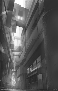
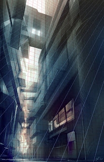
Here's the early stage of lineart and blocking in light and shadow. This is where grid line comes in real handy for keeping things in perspective

From here I would use the color balance layer to get the general color scheme I'm looking for. The whole thing came together relatively quick because I kept things loose without trying to render every little detail which would've taken forever.

Then comes the fun part of scouring the internet for neon signs and other random bits, tweaking the colors, re-tweaking, and adding textures.
And there you have it. Go Canada Go!

Oooh awesome rob. I liked the way it turned out. Did u use Overlay to paint your grey scale? I've been using that a lot actually. I find it helps out, but then u have to paint ontop of it afterwards cause, overlay paintings tend to look like overlay paintings. Mass effect 2 inspiration XD? Love it!
ReplyDelete-S
yeah only use overlay for light sources because things can get really saturated. Color balance layer works better for the most part
ReplyDeleteoooo very cool, first thing I thought was Bladerunner when I saw it.
ReplyDeleteReally cool image... I love to see the process, your rough looks so clean!
ReplyDelete